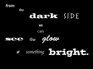

Design Rationale
The featured quote is a lyric from a Dave Matthews Band song titled "Pig". The quote is something we can all relate too and can look to for motivation on those bad days. I feel as if the quote is a creative way of saying "when one door closes another one opens". I kept a simpler font for the smaller words because I didn't want to bring too much attention to them (Franklin Gothic Medium, Platino, Mezz Web Pro, and ITC Novarese Std). For the word dark I used the Wide Latin Font because it was dark, bold and a little eerie. I used Rustica LT Std for the word side because it was a flat font like the side of a house or box. Madrone Std was used for the word see because it was big and bold like eyes. I used Brush Script Std for the word glow because it's a light yet fun font. Meddici Script LT Std was used for the word something because its a significant part of the lyrics but it doesn't stand out like the power words. Lastly, I used Postino Std for the word bright because it was bold, fun, and stood out. I arranged the beginning on an angle going left to right and up to down because I wanted the words to look like they were moving. I kept see the glow in the middle because I wanted just that. Besides learning how to use a new program on a new computer I had a hard time with some of my fonts. Even though some of my words were very descriptive and colorful, I wasn’t sure if I was using the right fonts. I asked for advice and feedback from others in the class who luckily agreed with me. I am most proud of the fact that I actually pulled this off and can say I am proud of it. I am also proud that I was able to bring DMB's lyrics to life. If I had more time I would learn more about Photoshop so I can elaborate and the font and color choice. For example, I would have like to make the word glow actually look as if it was glowing.


