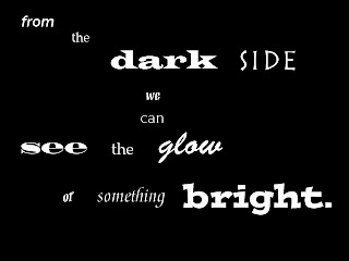
Tuesday, May 18, 2010

Tuesday, May 4, 2010

Thursday, April 29, 2010

Brochure and Webpage


We decided to stay with a very simple yet patriotic theme for our brochure and website. We thought too many outrageous colors would be distracting. Bristol is very nautical and patriotic so we decided to keep with the same theme. Our cover features the Bristol parade logo with a nautical start which can be found on almost every house in Bristol. Inside we inserted a picture of the parade route. We also added an events page and some history about our countries oldest running fourth of July parade. We also put in some scenic pictures of bristol and a sponors page because a lot of local and state wide sponsors are involved with the parade. We kept a similar theme with our home page. We wanted to keep it simple and easy to navigate because people from all over the region come to celebrate. We used the same colors and same fonts for the homepage as well.

Friday, April 9, 2010

Concert Poster


For this poster I decided to just use Dave Matthews instead of the whole band. As much as I would have liked to feature the entire band on the poster, it would have been to busy and distracting. I like how I used the picture as the background of the poster and was able to write over it. I played with the size and spacing of the text for the band name. I thought it mixed it up and didn't look so tradition. Even though it was hard I didn't center it either hoping to make it more edgy. I chose Washington as the location of the concert because The Gorge is one of DMB's most famous venue's. Here, fans camp out for three days all for their favorite band. The venue, dates, and times are the actual locations of the upcoming summer 2010 tour. The WAREHOUSE logo on the bottom right of the poster is the DMB fan membership site. The Warehouse allows fans to buy their tickets before anyone else. The poster features all the necessary information without being to busy or overwhelming .

Monday, March 29, 2010

Michael Buble

Michael Buble

I am really happy with the way this slide show came out. I decided to stick with mostly black and white with a little yellow as my color scheme. Michael Buble's music is classic as is he. He always preforms in a black suit. I also chose a classic font because it's not simple but it wasn't over the top. I took the yellow from his current album, Crazy Love. I kept the slide slow crisp and simple but it was still interesting. If I had more time and experience I would have made the music transition a little smoother. Overall, I am happy with the way it came out. I now know how to add music, transition one slide to another, and fade bullet points.

Thursday, March 4, 2010

Animated Font Poem

Photobucket

I took my final font poem and was able to animate it. I chose to show the small words for .5 seconds and the dramatic and colorful words show for one second. I then made a collage for the end of the font poem. I chose to start with a sunrise because when its dark that's the first form of light we see. Throughout the night we always know the sun is going to rise which lives a lot of people hope. I chose to add in a fire dancer on the top left. The fire dancer is a universal logo for the Dave Matthews Band. A fire dancer is also something that is said to bring us light in the night. I also added fireworks and lamp posts which remind me of things that brighten up the sky when it is dark out. I faded the images to 65% so you could still see them and still see the sunrise in the background.

Wednesday, February 24, 2010

Thursday, February 18, 2010


For the first row I started with a photograph that was 1200 dpi. After that I kept changing the dpi to 600, 300 and then eventually 72 dpi. For the second row I found a picture that already had a lot of color. I then used the different color settings to change the color of the image. The color RGB fades the color a little more than the original. The Duo tone changes to a sepia colored photograph and the B&W is clearly black and white. I made the mistake of trying to do DuoTone before Black&White. However, you have to change your image to black and white and then to DuoTone. The third row had a lot to do with cropping landscape and portrait pictures. The fourth row was the framing row where we cropped a photo with a 1.333 width and kept cropping the imagine until the last column. The fifth row was the Content row, similar to row 4, I kept cropping and cropping. However for the fifth row we cropped and focused in on an object with an interesting texture. The sixth and final row was the most exciting for me. I look an image and was able to play with colors and textures of the pictures. I used Poster Edges because he is from my favorite band and I thought it fit. I also used glowing edges because its trendy and different. Lastly, I used Conte Crayon because I love the black and white affect. This image also looks like someone could have sketched his portrait.

Thursday, February 4, 2010


Design Rationale
The featured quote is a lyric from a Dave Matthews Band song titled "Pig". The quote is something we can all relate too and can look to for motivation on those bad days. I feel as if the quote is a creative way of saying "when one door closes another one opens". I kept a simpler font for the smaller words because I didn't want to bring too much attention to them (Franklin Gothic Medium, Platino, Mezz Web Pro, and ITC Novarese Std). For the word dark I used the Wide Latin Font because it was dark, bold and a little eerie. I used Rustica LT Std for the word side because it was a flat font like the side of a house or box. Madrone Std was used for the word see because it was big and bold like eyes. I used Brush Script Std for the word glow because it's a light yet fun font. Meddici Script LT Std was used for the word something because its a significant part of the lyrics but it doesn't stand out like the power words. Lastly, I used Postino Std for the word bright because it was bold, fun, and stood out. I arranged the beginning on an angle going left to right and up to down because I wanted the words to look like they were moving. I kept see the glow in the middle because I wanted just that. Besides learning how to use a new program on a new computer I had a hard time with some of my fonts. Even though some of my words were very descriptive and colorful, I wasn’t sure if I was using the right fonts. I asked for advice and feedback from others in the class who luckily agreed with me. I am most proud of the fact that I actually pulled this off and can say I am proud of it. I am also proud that I was able to bring DMB's lyrics to life. If I had more time I would learn more about Photoshop so I can elaborate and the font and color choice. For example, I would have like to make the word glow actually look as if it was glowing.